4 Remarkable Web Design Trends of 2020

Web design is like flowing water. You can’t fight it, but it is always better to flow with it as you will encounter trends that will lead you to impressive web designs.
Various factors help create a futuristic design for 2020. Such as,
- Inorganic Shapes
- Black and White Pallets
- Simply Minimalist
- Glitchy Art
Let’s go with the flow of web design trends that will help you stay on the surface in 2020.
Inorganic Shapes
Even though websites have systematic gridding, nowadays, designers are persistent towards natural shapes and smooth lines. Edgy corners of geometric structures of parallelograms do create a sense of stability, but in the year 2020, trends are more likely to develop a feeling of accessibility and comfort.

Misaligned shapes even though sound asymmetric and imperfect, they provide depth to a web design that makes page elements stand out. Such free-drawn factors can help web designers to capture the spontaneity of human-made accidents such as paint splatter.
The primary goal for web designs is to have a human touch through which it can engage visitors.
Black and White Pallets
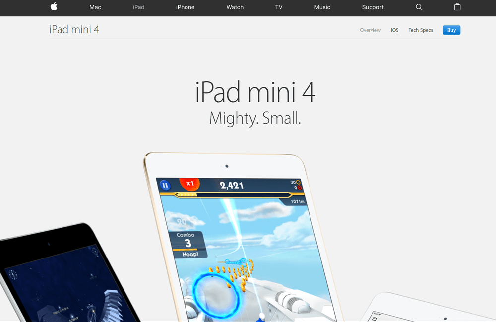
Colour is the primary element in a website. Studies show that 90% of the people’s decision is based on the color of the site. It’s true as color cultivates a mood, unifies a brand, and guides users through an interface by creating visual landmarks.

Credits: Apple
The reason for using black-and-white palettes is that when color is missing, people begin to see the world differently as textures and shapes become sharper.
White creates a clean and reserved impression, whereas black makes it strong and assertive. Combining these two generates a striking look.
Simply Minimalist
The year 2020, we will catch sight of the website whose content will be more video with voice script and less text, heading towards precision over description. Web designing is going to be more minimalistic that will open the door for more straightforward navigation.
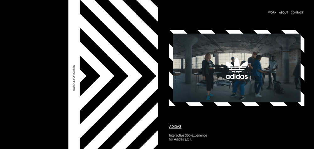
With the emergence of wearable devices, web design is getting micro. The most affected due to the minimalization area is navigation, the glue that holds a website together. With the help of a simple and minimalist approach of web design, navigation is getting user-friendly and coherent to accommodate tiny devices and even smaller attention spans.

Credits: Adidas
Extremely minimalist navigation immerses the user in the website as they won’t be suffering any issues about moving around the site and wondering.
Parallelly, images and videos are becoming essential. Hunky and hulky photos and videos are your chance to impress users while removing excessive texts.
Glitchy Art
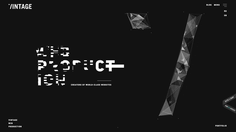
Reinventing some retro designs is the way to make people feel nostalgic. Glitch art is the retro design that we used to encounter during a crinkled film or a slow dial-up connection, which generates a distorted and unintentionally striking image.
Glitches are significant in our modern times as computers are becoming too pervasive. The breaking down of technology makes an eye-catching subject for web design, where it can draw the viewer’s attention to those parts of the site that are warped, double-exposed, and glitchy. Such art amplifies the feeling of disorientation by giving websites a distinctly psychedelic look.

We believe utilizing these trends will make your website funky as well as interactive to get more session time.
RiffScript is a creative web design company that applies unique trends to make the website more elegant. Our aim is not only to work with clients with the utmost professionalism but to develop a long term relationship by providing suggestions for other aspects as well. Get in touch now to learn more about web design.
